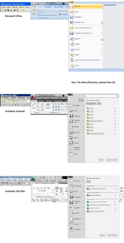
Ribbon mania – comparison
As promised in my previous post, here is a rapid visual comparison of the old style menu bar for MS Office, Autodesk Autocad and Autodesk 3ds Max. As the screens get shorter and wider, I was commenting along my friend’s Len post, suggesting that the ribbon style UI makes the situation even worse for the user crunching even more on the number of pixels available for actual work. I assess only the default state of the UI, not the different customizations one could do to get it back to how it was or similar.
The first column is the old style menu, the middle one is the ribbon, while the big bad left one is the new “file” menu, if you believe it. I was ashamed to post the old file menu….you would have cried…
So while it might be enjoyable to see movies all day long on a very wide monitor, for those of us who care to do a little work every now and again this new system sucks.


No Comments, Comment or Ping